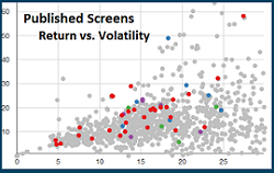
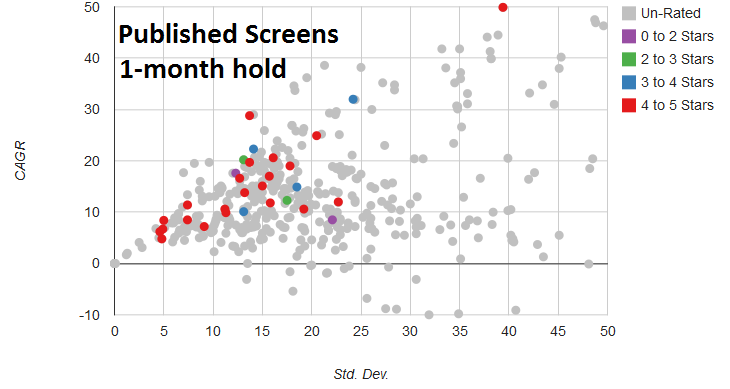
Published vs un-Published Backtests

pubScrns1mo

click to enlarge

When our new Risk-Return Chart was introduced a couple of weeks ago someone asked if the distribution was any different for favorite screens that are unpublished.  It was an interesting question so we did a little analysis to compare the published screens with the unpublished favorites.  The chart to the left shows all published backtests for a 1-month holding period.  We limited this to the 1-month screens because that is where most of the backtests are focused. Continue reading

Screen Spotlight: GLD,RSP,TLT,ZIV

Screen ChartWith this post we begin a new series of spotlighting the screens that show interesting performance on the new Risk Return Chart we introduced last week.

The first screen in the spotlight is  “GLD,RSP,TLT,ZIV”,  which is appropriately named because those are the only four symbols included in the screen.  The screen backtests well and looks promising on the Risk Return chart, but that is not the only reason it was chosen.  We often receive emails about how to interpret screens.  This screen breaks many rules on the surface, but in the end is a  very simple screen and may be effective.   Continue reading

Early Summer Additions

Return vs Volatility ChartYesterday and today we made one addition and one notable change to the site.  The addition was a page to illustrate the risk – return relationship of your Published Screens.

The chart on this page is dynamic in nature so you can zoom in and out and click any point for more information on the backtest represented.  From the subsequent pop-up window you can click a link to view the backtest in full detail and then return to the chart of return vs volatility to explore another model. Continue reading